Rebranding
of Zim Afro T10
Reimagining of a cricket tournament into a full-scale sports and music festival. Positioning the event as a cultural platform, engineered to captivate a new generation of fans while uniting those who came before.
- CREATIVE DIRECTION
- VISUAL IDENTITY
- BRAND STRATEGY
- TONE OF VOICE
- BRAND SYSTEM
CLIENT
ZIM AFRO 10
ROLE
BRAND DESIGNER
TIMELINE
6 WEEKS
TOOLS
FIGMA & PROCREATE
Anatomy of the name
This rebrand required a new name. The old name, Zim Afro T10, was simply descriptive and geographic. It told you where the league was from. But it carried no feeling, cultural weight or invitation. Drawn from local Zimbabwean language, tamba captures the dual soul of this league. The athletic play on the pitch and the rhythmic, joyful movement that fills the stands. It's a word that belongs to the people the brand is for. T10 is the cricket format. Fast, electrifying, and built for a generation with an appetite for high-intensity entertainment. Fused into the name itself, 10 isn't a category label anymore; it becomes part of the brand's identity.
“TAMBA” CAPTURES MOVEMENT, RHYTHM, AND JOY — THE TWO WORLDS BEING BROUGHT TOGETHER IN A SINGLE WORD.

Carrying the soul of the brand and what shaped it
Drawn from the local language. It signals this is a brand that belongs to Zimbabwe and Africa, not one imposed from outside. Short, rhythmic, and easy to say in any language it travels well for diaspora audiences in other parts of the world. "Play" speaks to cricket. "Dance" speaks to culture. Both meanings are true at the same time. The name is a foundational layer within the brand strategy. Tamba gives people something to chant, wear, and own.
A League that lost it's roar
A league with a hybrid format that blends cricket with the energy of African festival culture. Despite its potential, the league had struggled to hold its ground. It had gone two years without a tournament, lacked a clear identity, and was lost among the noise of global franchise leagues. The brand wasn't working hard enough for what the league could become.
- Weak or inconsistent commercial support
- Lost among global sport franchises
- Lack of clear identity
- No tournament in two years
Reading the playing
field
The competitor analysis and market insights converged on a clear conclusion: no competitor in Africa is running a hybrid T10 cricket and culture format, creating a powerful opening for Tamba10 to own an entirely new space. Africa's youngest-in-the-world population is deeply engaged with music, sport, and digital culture, making it a uniquely dynamic market for exactly this kind of proposition. Meanwhile, Afrobeats and Amapiano are reshaping global culture, signalling that Africa is no longer a niche market but a powerful export redefining entertainment worldwide.
The words that lay the foundation of the brand
This vision reflects three ideas. First, unity, bringing people together through sport and music. Second, African talent, celebrating the players, artists, and creators shaping the continent's future. And lastly, rhythm, the pace, energy, and excitement that define both music and cricket.
Become a unifying force that takes African talent out of bounds, where rhythm meets the pitch.
BECOME A UNIFYING FORCE THAT TAKES
COMMUNITY
BRINGING PEOPLE TOGETHER
POWERFUL SPIN FORCE
FORCE TO BE RECKONED WITH
AFRICAN TALENT OUT OF BOUNDSSCORING HIGH IN CRICKET
GOING FURTHER THAN EXPECTED
EXPLORING OUTSIDE THE KNOWN , WHERE
WHERE RHYTHMPACE MEETS THE PITCH.CRICKET PITCH
MUSIC PITCH
The mission fuses both worlds in a single breath sport and sound, ambition and identity. It's not about running a cricket league. It's about creating a movement. The goal is not just to host matches, but to create a destination, a place where sport, entertainment, and community come together, a homeground. This vision stakes Zimbabwe's claim on the continental stage, not as a participant, but as the host of something the world comes to.
To establish Zimbabwe as Africa's home ground for cricket and culture
With the mission and vision defined, the creative platform needed a headline one phrase that could carry the whole brand on a stadium screen, on a t-shirt, and in a conversation. It had to land in two places at once.
UNMATCHED
In everyday language, unmatched means without rival, without comparison, in a league of its own. It's a declaration of ambition for everything Tamba10 represents, the talent, the energy, the cultural experience. In cricket, a match is the game itself the competition, the contest, the moment everything is on the line. UNMATCHED says this league and the experience it delivers are beyond comparison. No other match comes close.
Turning strategy into a look and feel
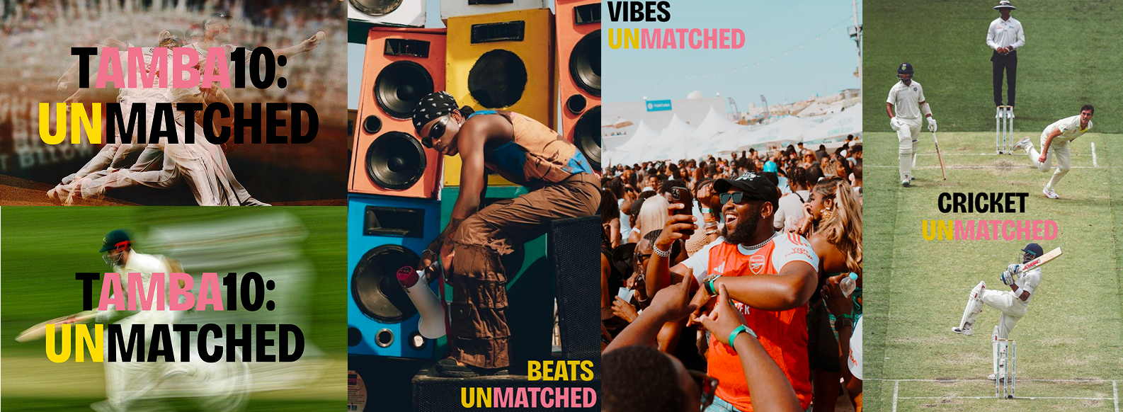
The brand speaks. Here is how it sounds
A brand identity isn't only what you see, it's what you hear, read, and feel when the brand communicates. Tamba10's tone of voice was built to be as distinctive as its visual system: culturally grounded, high-energy, and always speaking to the specific people it's for. This section covers the four voice pillars, the audience it speaks to, the visual content direction, and the rules that keep the voice consistent.
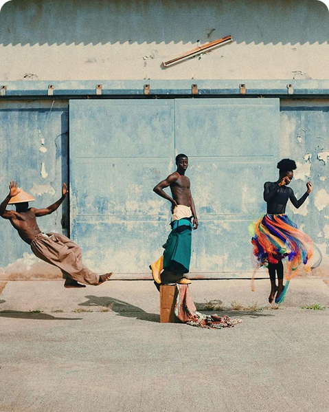
The Bend Backer
The Bend Backer represents effort and intensity — the relentless energy required to create fast, electric cricket experiences.
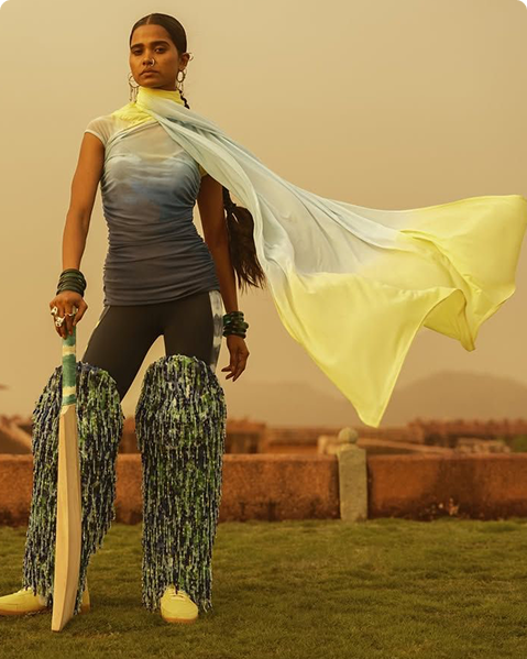
The Sweet Spotter
We hit the sweet spot between music and cricket and create opportunity of emerging African talent.
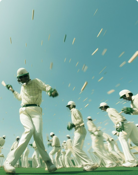
The Fast Bowler
The Fast Bowler represents momentum — constantly pushing forward and striving toward greater potential.
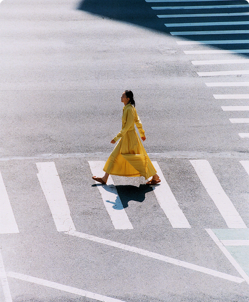
The Crease Popper
Crease Popper represents boldness — breaking boundaries and placing Zimbabwe and African talent onto the global stage.
It is “energetic” never whispering, with sharp, momentum-driven language that moves at the speed of the game itself. It is “inspiring” consistently signalling that something bigger is possible, celebrating people and potential as much as performance, and connecting sport to a deep sense of pride and possibility. It is “progressive”, always looking forward, championing emerging African talent, embracing new formats, and actively challenging the outdated narratives that have long defined how the world sees Zimbabwe and Africa. And it is “empowering”, using language that is intentionally inclusive, leaning into “we” and “our” to reflect a collective movement where everyone feels genuine ownership and belonging.
“THE BRAND SPEAKS LOUDLY, MOVES FAST, AND ALWAYS SOUNDS LIKE IT BELONGS TO THE PEOPLE”
The tone shifts in register depending on who's in the room but the four pillars stay constant. Four audience archetypes define who Tamba10 is speaking to at any given moment.
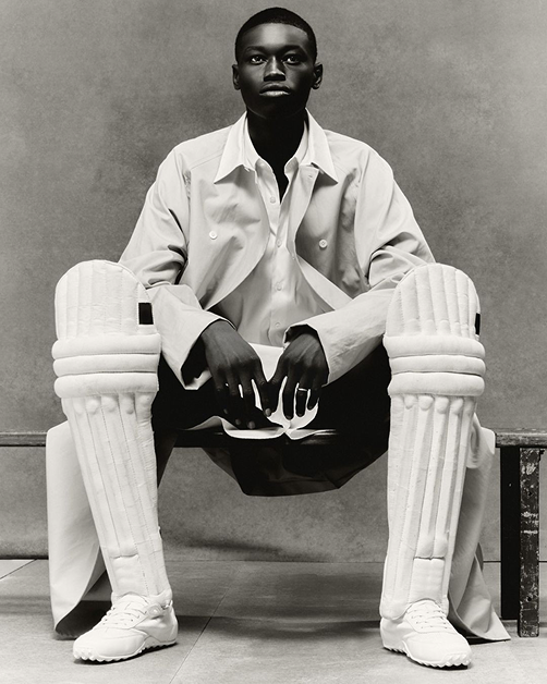
Who are we talking to?
Speaks cricket. Lives for the stats, the players, the rivalries. The voice earns their respect through knowledge and energy.
Here for the music, the fashion, the vibe. Drawn in by culture and then surprised by how much they love the game.
Diaspora. Far from home but deeply connected. The voice gives them something to belong to, wherever they are.
Young, ambitious, watching from the boundary. The voice signals that the stage is being built for them.
The colours that carry the brand
The colour palette was built to balance energy, culture, and performance. The system combines bold signature colours with supporting neutrals, creating flexibility across campaigns, digital platforms, merchandise, and event experiences.
PRIMARY
#DCBE00
Ashanti Gold
Named for the gold-rich history of the Ashanti Empire (West Africa).
PRIMARY
#E17B8F
Namaqua Bloom
Inspired by the wild spring flowers of the Namaqualand (Southern Africa)
SECONDARY
#EDF2F4
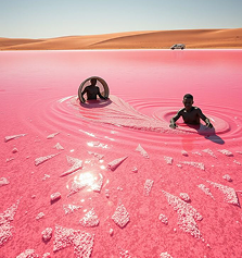
Salt Basin
Inspired by the Makgadikgadi Pan (Botswana) and the white-hot midday sun.
TERTIARY
#2A0800
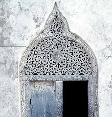
Iroko Heart
Named after the dark, durable Iroko wood found across Tropical Africa.
TERTIARY
#050609
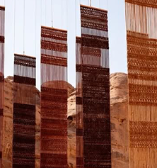
Obscure Night
The deep, clear sky of the Sahara at midnight.
Type that plays both roles
The typography system was built to balance personality with readability across all contexts. Campingo carries the expressive weight of headlines. Dark Gothique handles body copy with clarity and structure. Geist provides a modern alternative for digital-first environments. Together, they form a system that can shift from stadium hoardings to social graphics to editorial design.
Built for the stands and the streets
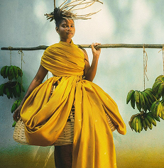
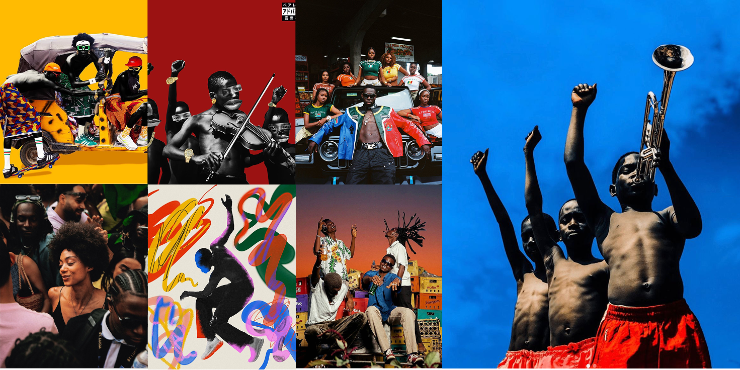
The art direction embraced collision, between sport and sound, between global and proudly African, between high energy and rich culture. The mood board drew from Afro aesthetics, street photography, and contemporary African visual art, positioning Tamba10 as a brand that belongs as much to the festival as to the stadium.
The marks we leave
Patterns and graphics bring the brand to life. Inspired by rhythm, movement, and African visual language, these elements add energy and flexibility across different touchpoints.
This illustration captures the fluidity and energy of the sport, while subtly incorporating the “T” form from our custom typeface. The sense of movement reflects the dual nature of tamba10, where music and cricket intersect. The inclusion of the bat grounds the visual in the sport itself, creating a seamless blend of rhythm and play. This can be used in many visual aids both digital and physical.

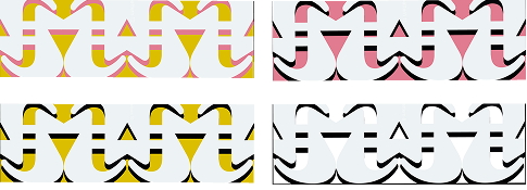
The following patterns are built from the custom “T” form within the Tamba10 typeface, transforming a single typographic element into a bold, expressive visual system. Repeated, rotated, and layered, the forms create a sense of rhythm and movement.

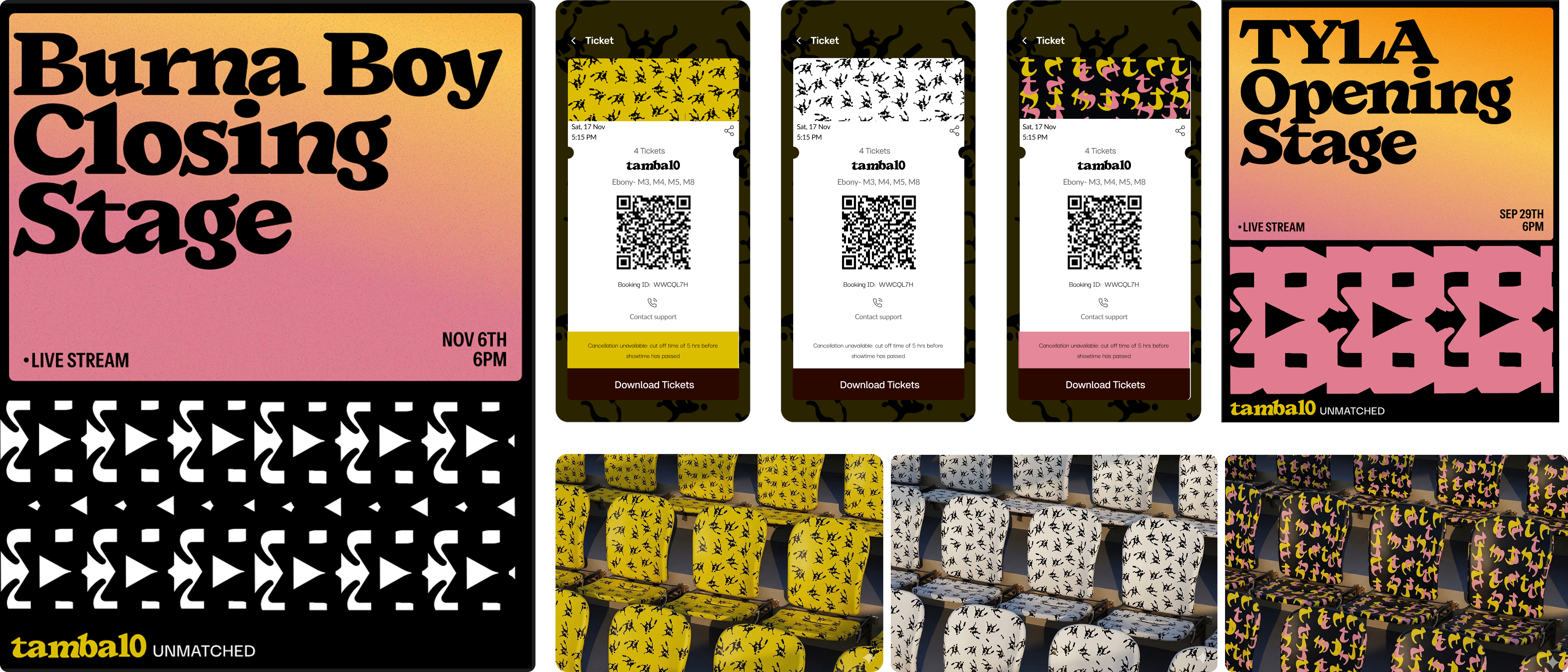
Digital Applications. How we show up in the world
Merging the digital and physical touch-points by having tickets reflect seat allocation with aims of creating a more seamless and enjoyable user experience. Different colours and patterns represent different tiers ie VVip, Vip.
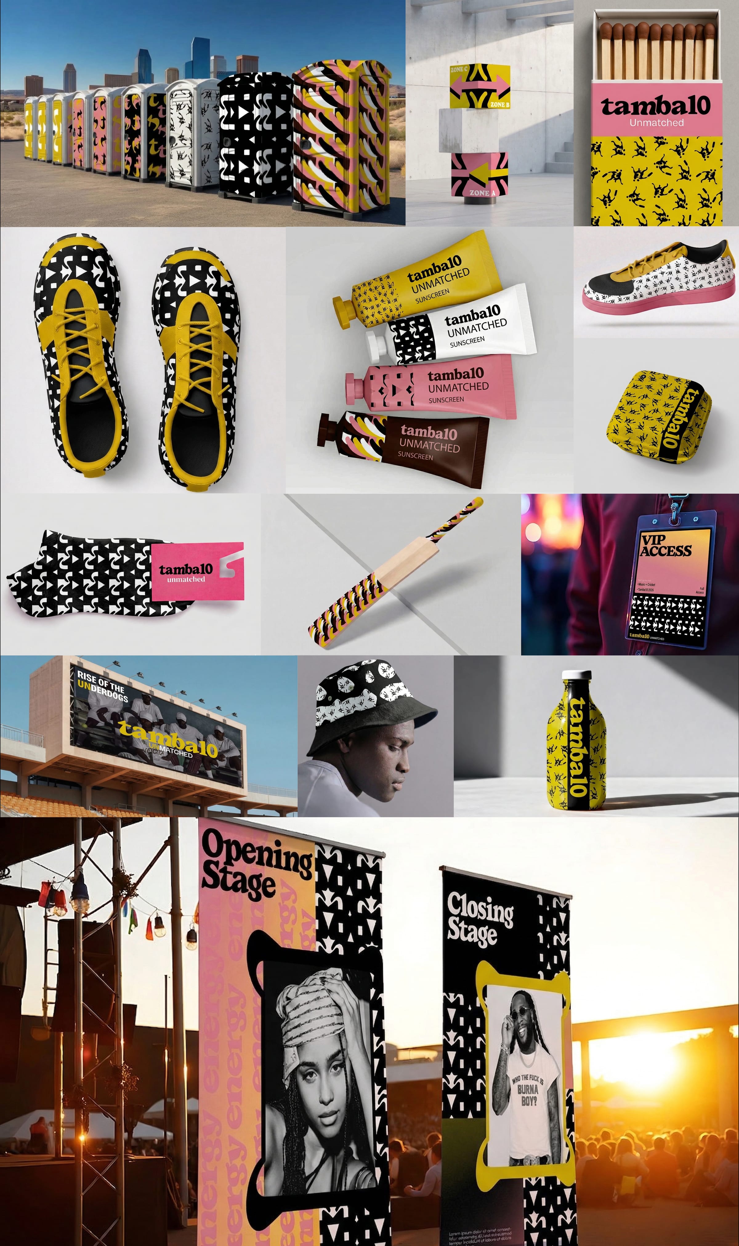
Physical Applications. How we show up in the world
The brand extends seamlessly into the physical world, showing up as something people can wear, touch, and genuinely be part of. From merchandise like bats, hats, and apparel to the full sweep of the stadium experience, including signage and wayfinding. Every touchpoint is an opportunity to deepen connection. Even the everyday details, like tickets, posters, and packaging, are treated as meaningful moments where the brand can leave a lasting impression.
Learnings from this project
Culture isn't a layer, it's the foundation. The strongest decisions on Tamba10 came from genuine cultural insight, with authentic understanding of Zimbabwean and African audiences shaping strategy from day one, not added as decoration after. Naming "Tamba10" proved how much a single word can carry: cultural roots, dual meaning, global pronounceability and reframing naming as serious strategic discipline. Designing for a cricket festival fused with Afro music meant the identity had to fit across a scoreboard and a stage, demanding a system built for adaptability. Ultimately, the goal wasn't to make Tamba10 look different but to make people feel like it belonged to them.
© 2026 Varsharanee